I started to analyze NME pages in depth, especially the contents pages and some double page spread. To see what style they used, and things to help me design my own.

They use very a vert stable layout that they use in every issue apart from maybe a special issue like christmas or an anniversary. The NME logo/heading is in the same place as it is on the front cover so it looks constant, then the words 'this week' in very large, larger than the logo font so it really stands out. The thing your eyes are drawn straight to. Then they always position the pages under clear headings on the right hand side of the page- the headings are very clear with a black background with white writing which is the opposite to the rest of the text of the page, this makes them stand out and look very bold. All the page numbers are in the same red as the red of the NME logo at the top and also links in with various other things on the page, for example the band index. In the middle of the page they put a picture and a small bit of information writing about what the picture, with a title that leads you in to the block of writing, this piece of writing makes you want to read on about the main article. This creates a nice lead into the rest of the magazine. Underneath this they have put an advert for subscription to the magazine with information about how to do. It is all in a black box, which is the largest bit of solid black a well as the title. It also has vibrant yellow text to make your eye go it as it a very contrasting colour. Then on the far left is a 'bang index' which tells you all the bands that have been in the magazine and where you can find them to read about them in the magazine. Then also around the page they put in small icons like the arrows down the main contents page part on the right, the arrows show what has been mentioned on the front of the magazine so you can easily find what you want to read about at a glance.
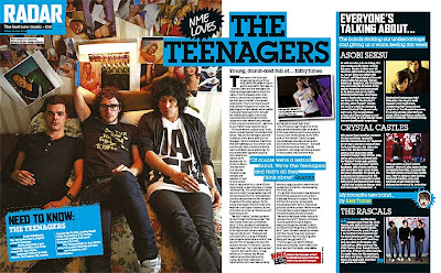
The double page spread is full of small personal NME features that make the page very informal and friendly to the reader- for example the 'nme loves' and 'need to know' theses small things make the page look interesting and fun. The page has a clear colour scheme, light blue and black, this makes the page look neater and helps it flow better. I like that the photo takes up most of the page and the interview isn't too long, but not too short, the use of a 'pull quote' makes the article look more interesting, and also gives you an insight to what it's going to be about. The NME website address at the end of the article allows you to keep up with the band and look at more bands similar to this one. The strip down the right side of the page with bands that are in the same league and similar genre to the main one helps link the page all together. It also goes with the colour scheme of the page so it is part of the page but clearly not entirely to do with the main band. Overall the page works really well with lots of information in a neat compact and without looking boring. Not too busy, but not too pain a good balance that i want on my double page spread.
Analyzing these pages i have a good idea of what i want to include in my magazine. How to lay it all out in a clear way that won't bore or be too much for my reader. With something to interest everyone.


No comments:
Post a Comment